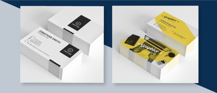
<p >As you all know, business cards are an extremely important tool to build up strong business connections with partners and prospects. In the end, the bigger your circle of connections, the bigger and faster the likelihood of success. That is the reason why we like to give you tips and insights about how to ensure that your business cards (and other printing products) come out perfect.
In this blog post, we will go through a summary of 10 measures that can help you make your business cards as impactful as possible. We also made these tips into an infographic, which we invite you to share with friends and colleagues.

1. Keep it simple
Only add the most important and necessary details on your business card, and do NOT add too much information. Information overload can have very negative impacts. The details that you absolutely need to add to your business card are your name, company name, company logo, your position, your telephone number, your email, social media contacts if necessary, and your business’ website URL.
2. Make it readable
2 things to make sure your card is readable: use an appropriate font, and use font size cleverly. Make sure that every piece of information is neither too big in size or too small, as it needs to be easily readable for a wide audience. Also, you can obviously use multiple font sizes on your card, to make more important elements such as your name and position stand out from the rest. Check out our suggestions for nice business card fonts here.
3. Visual Content
To make your content stand out and make it personal, you can always use images or graphics that will catch people’s attention. But don’t just add any image or graphic, pick one that goes with your personality and brand. We all know that too much text is not interesting, and nobody wants to read anything from a business card. To convey a specific message, it’s better to do so with images and/or icons.
4. Use White Space Cleverly
Make use of the white space between your text information to not make your card look too heavy. Too much text on the business card might leave recipients overwhelmed and confused as to where they should look. White space will always make your content more visually pleasing and readable. White space can also be used to make certain elements stand out. Furthermore, business cards with a lot of white space are quite trendy these days, because they look quite premium and minimal. Did you know that you can design your minimal business cards right here on the Gogoprint website, using our online design editor
5. Bleed and Safe Area
Before you actually start designing your business card, don’t forget to add Bleed of 0.3cm and safety margins of 0.3cm on each side. To add bleed and margins can be confusing sometimes (depending on the software that you use), which is why we have a blog article and video that shows you how to do it in Word and Illustrator. Read here why bleed and margins are so important for printing quality. Once you added it already, you can safely start designing your cards. Also, Don’t forget to use images with the right resolution in your artworks. More details about that here
6. Express personality and identity
Business cards must reflect your personality. That is why we have to think well about what your brand should represent to people. For example, if you are a graphic design agency, you might believe that “less is more”, and therefore focus on simple, clean, and modern design.
7. Promote yourself and your brand
The main goal of your business card is to be remembered, in order to develop partnerships and nurture business opportunities. That means that people should think about you and your company whenever they need something. You should use your business cards to promote yourself as well as your brand. Explain what you do on the business card and show people what level of service they can expect.
8. Avoid Using solid borders
Using a solid border on the edge of your cards might look good in theory, but when the cards are cutted, you will most likely have some ‘lop-sided’ edges. Cutting equipment is not 100% accurate, which means that there can be 0-2mm of inaccuracy with respect to the cutting line. In the end, you risk ending up with borders on some sides that are not as wide as what you expected. In a nutshell, you should always avoid using solid borders on your business cards.
9. Special finishing: lamination, round corners
To really stand out among the sea of business cards that professionals receive on a yearly basis, add some lamination and/or rounded corners to the business card. Printing equipment is getting more and more advanced, so you can now spec a variety of finishes that give your card a personal and premium touch. Just so you know, we are currently working on adding things like Spot UV to our website!
10. Color choice and Color complementary
Finally, never use more than three colors on your business card and do some research about color psychology to make sure that your cards send the right message. In a nutshell, you should choose your colors based on your branding, and based on the message that you want to send across. You should also always make sure that the colors that you pick work well together.
That is it, friends. Those were our 10 tips to design and print awesome business cards. Share our infographic with as many people as you like (the more, the better), and stay tuned to the GGP blog fore more details.


